Redesigning Bumble BFF
As a project for General Assembly, we were presented with a scenario and a challenge: Bumble wants to evaluate the effectiveness of their approach to friendship and find ways to add features to make the search for friends more effective.
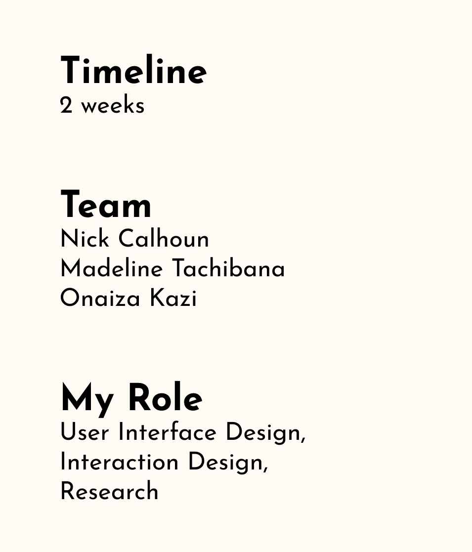
This was a collaborative effort between myself and two teammates.
We each contributed to the research, ideation, and design of this project.

The Brief
From its founding, Bumble has set out to change the world of online dating by shaking up gender norms and providing their community with a place where they can feel safe and respected. After securing their footing in the dating market, they set their sights on friendship and created Bumble BFF, but in the process they reintroduced many of the antiquated policies they set out to get rid of.
We were given two weeks to research, design, test, and present a solution. We began by downloading Bumble and recording our initial thoughts.
Discovering & Defining
During our initial review of Bumble BFF, we found many opportunities for improvement.
- Users can only be matched up with people of the same gender. We understood that this decision was probably made with safety in mind, but we felt this was too limiting.
- When asked to define their gender during account creation, if a user selects any option other than male or female, they’re asked if they’d like to be shown to men or women — why be inclusive only to immediately take that away?
- BFF has less features than its dating counterpart. Missing were the 5 interests to display on your profile and the “Question Game” feature used to spark conversations and break the ice.
Overall, BFF behaved a lot like a pared down version of Bumble Date — you start swiping, get matched up, and have 24 hours to send a message before the match expires, having only a fairly limited view of who someone is before making your decision.
We felt Bumble BFF was devaluing the intricacies of friendship and ignoring any possible differences that exist between platonic and romantic relationships.
Asking Others
Before diving into our research, these questions were top of mind
- How does one define friendship?
- What qualities do people look for in friends?
- What are the differences between platonic and romantic relationships?
How might people pursue these relationships differently?
We created an online survey using OptimalWorkshop and, while we waited on the results to come in, we began conducting interviews and usability tests on Bumble BFF with 5 candidates.
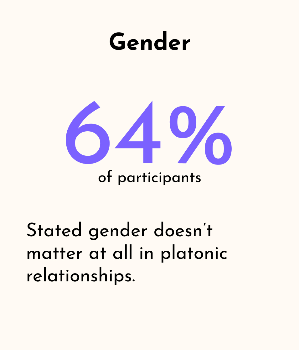
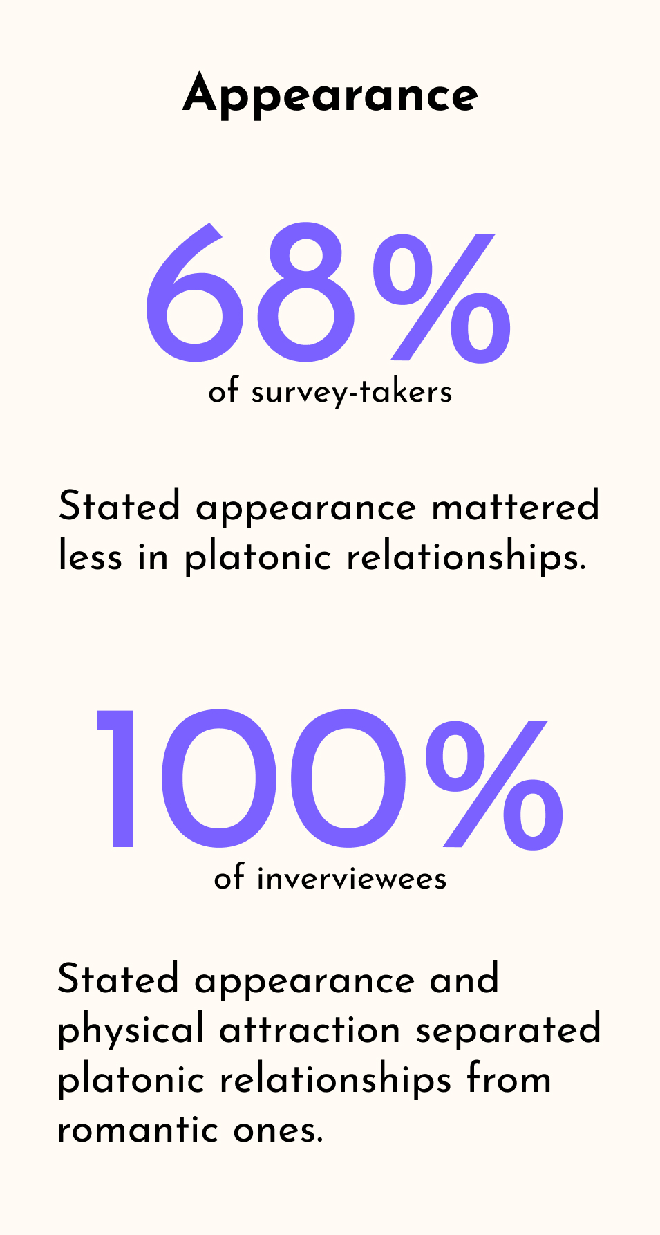
We wanted to determine what sort of qualities were important to people when looking for new friends. We provided a list including appearance, gender, values, and interests and asked users to rank them in terms of importance. We also asked participants how they know when they’ve connected with someone as a friend.
The Results
As part of our survey, made by Onaiza Kazi, participants were asked to rank qualities by level of importance when making new friends.
Other key takeaways
- During usability tests, users continually expressed that BFF felt like a dating app, specifically citing the profile layout and swiping feature.
- Participants that identified as a gender other than male or female disliked only having two options to choose from when selecting who they’d like to be shown. All participants disliked only being shown users of one gender. Many suggested either a third option for “any” or a way to select multiple.
- Participants disliked that they could only select one option when filling out the “looking for” section during profile set-up. Many noted that it sounded like a question to ask on a dating app and that the options it did offer were too limiting. Most chose “anything” as the option.
We felt our initial observations were validated and that we had a clear path ahead of us.
We held a design studio and each sketched out our initial ideas while keeping our research results and these ideas in mind:
- How can we facilitate a virtual space for people to get a good idea of who someone is and what they like?
- How can we make Bumble BFF feel differently than a dating app?
- How can we show our users potential friends outside of their gender without sacrificing inclusivity or safety?
Initial Ideas
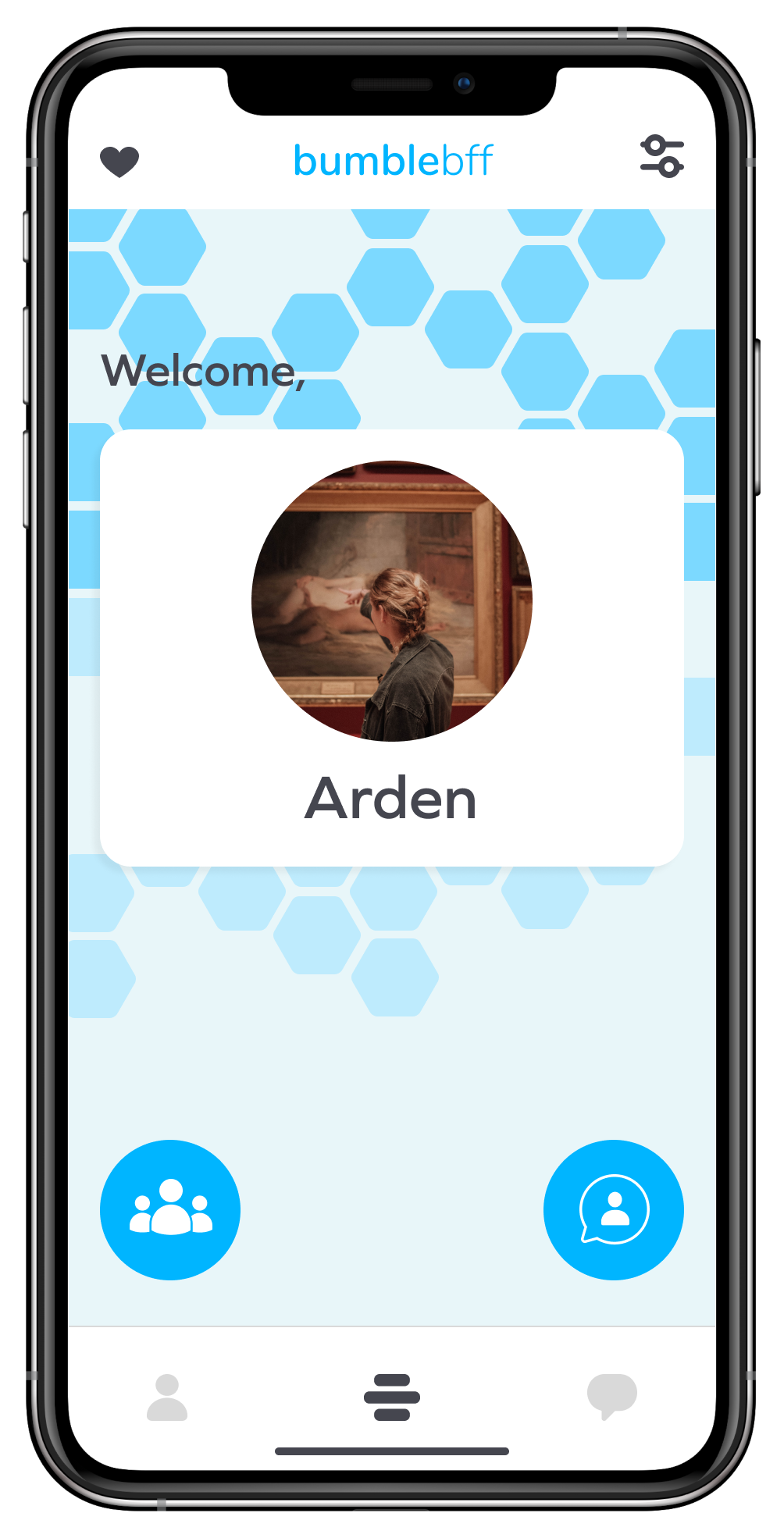
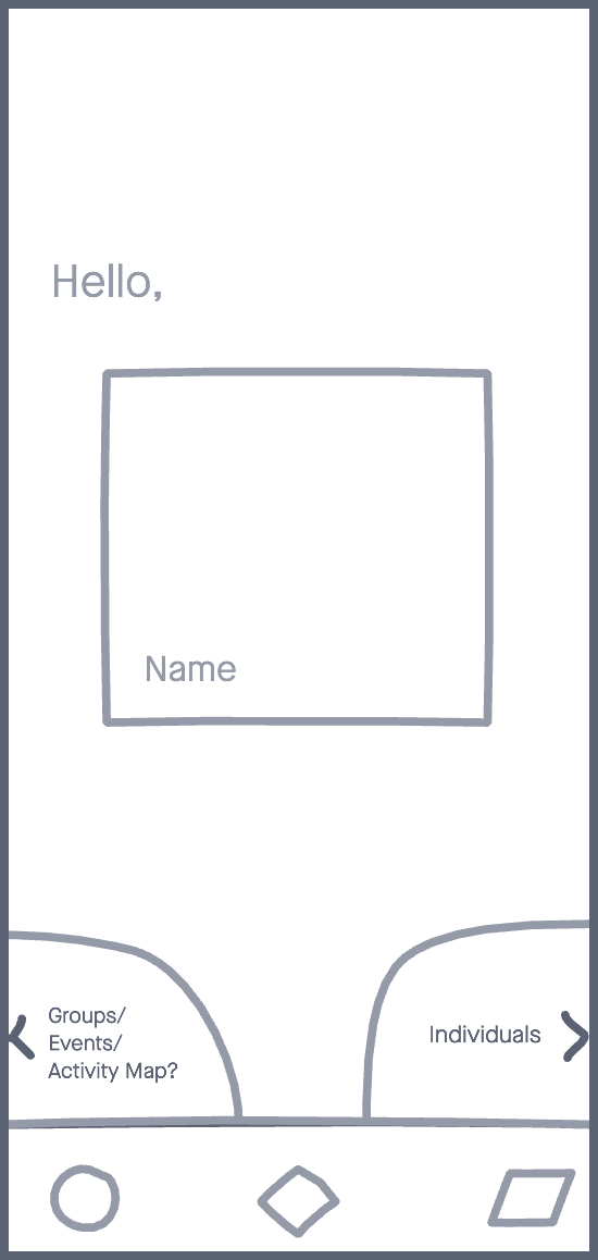
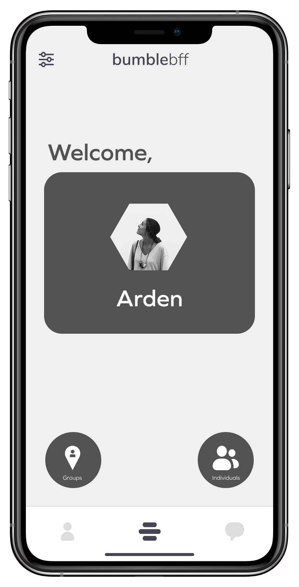
Home Screen - adding room for extra features
My team and I had discussed implementing some way for users to potentially meet and/or chat with multiple people at once. We were still unsure of where to take this feature, but I knew that we needed to at least have space for this to be implemented. This meant we needed a homepage, which Bumble usually reserves for swiping-on and viewing other’s profiles. I came up with this sketch for the homepage which would allow access to daily matches (swipe right) and groups (swipe left).
Tapping on the profile card would open up the user profile. From there, users would be able to edit their profile and their filters/preferences.
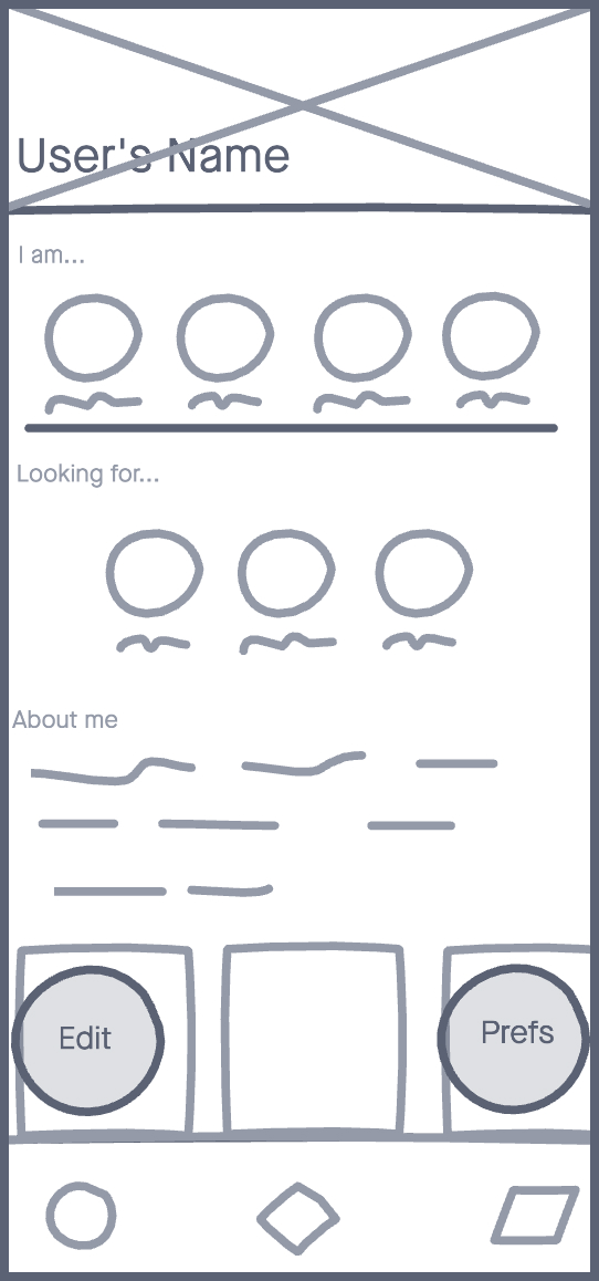
The Profile - personality through personalization
I wanted users to be able to get a quick snapshot of someone’s personality and thought incorporating profile badges (see the “I am” and “Looking for” sections) would accomplish this. They could either choose them from a database, like Bumble already does, or add their own custom badges. They could then choose a limited number that would be displayed at the top of their profile.
Bumble already implements a similar feature when users are adding their interests and daily habits and attaches these badges to their profiles. I thought expanding on this could give us the outcome we wanted.
When viewing someone elses profile, users would see a similar layout, but "Edit" and "Preferences" would be replaced with "Games" and "Chat" respectively.
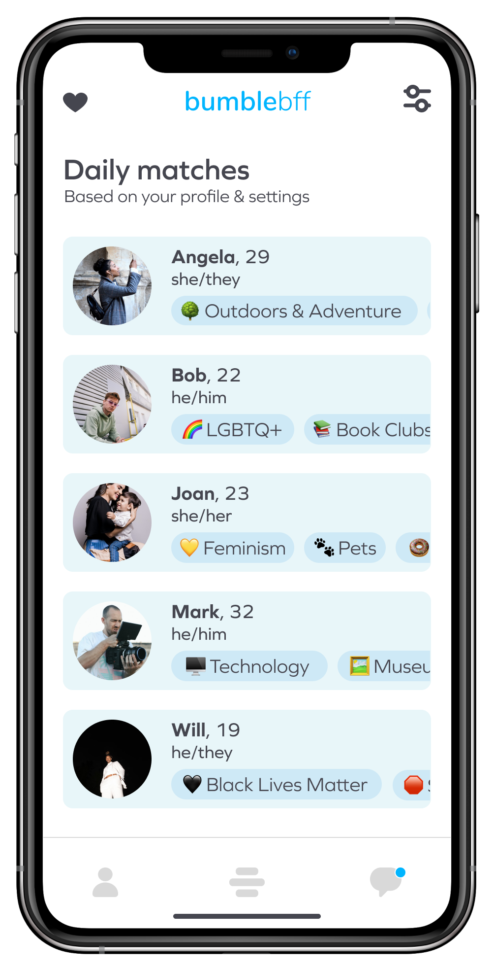
Daily Matches - Swiper, no swiping (on people)
This was the most extreme change.
I came up with the idea for daily matches because I wanted to eliminate the swiping interaction that has become synonymous with dating apps. I felt this would be the quickest way to remind users that they were here for different reasons. Instead, swiping would be used only for navigating through menus.
Using Bumble's implemented filters combined with all the information users have entered on their profiles, Bumble would then generate a persisting, daily list of matches that best fit a user’s criteria for them to choose from, while easily seeing which badges they’ve added to their profile. I felt that this would give users time to think about the decision to pursue a connection.
We reconvened after our design studio to discuss what we'd come up with. Having each come up with some sort of “snapshot” idea for our users to get a quick glimpse of one another, we combined them and ended up using an emoji+description combo which is similar to how Bumble Date allows users to select their interests, but our version would offer more opportunites for customization.
Further changes we discussed
- Fleshing out filters & decreasing the emphasis on gender: While we didn't want to remove gender from the equation entirely, we didn't want to continue to force users to only be matched up with those they share a gender with. We decided to update the preferences and filters to allow users, at any time, to choose what sort of folks they'd like to be shown to, and which ones they'd like to avoid. This could include age, location, profile badges, or gender.
- Hives (groups): Proposed by Onaiza Kazi, this feature would allow users to find and join groups sorted by interests or activities, allowing users to potentially meet multiple people at once that they shared something in common with.
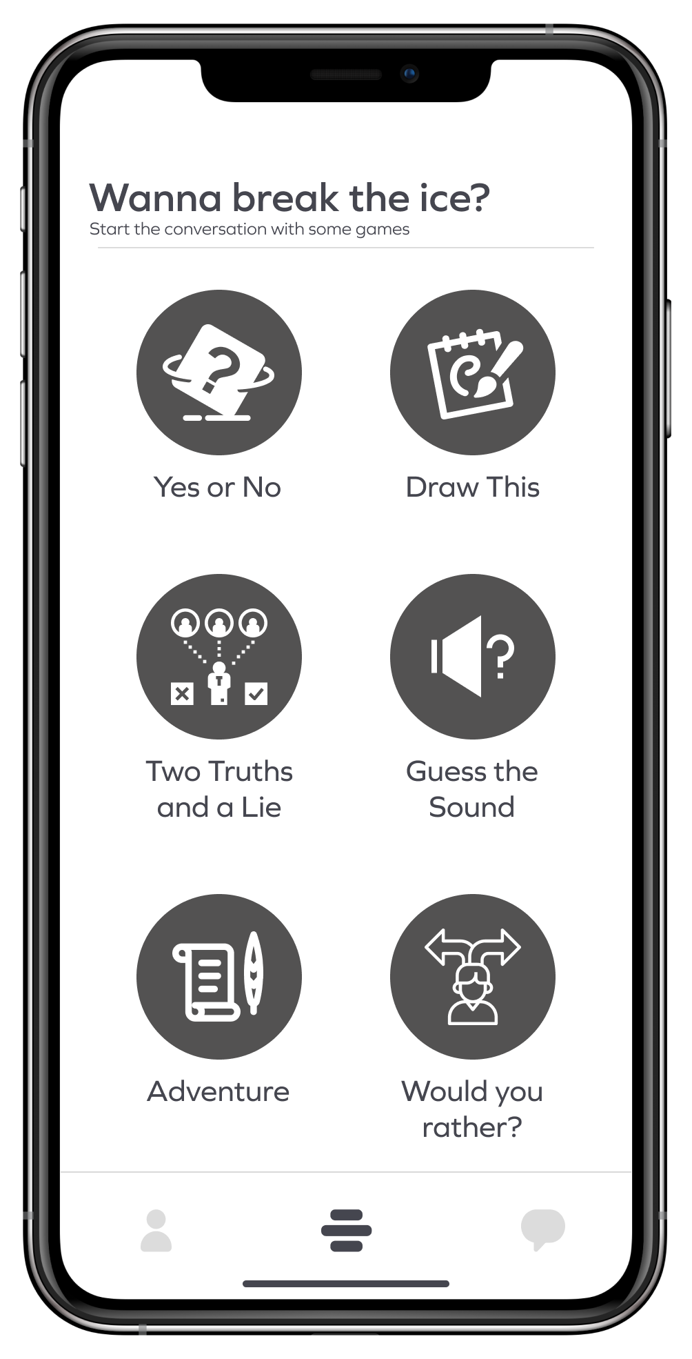
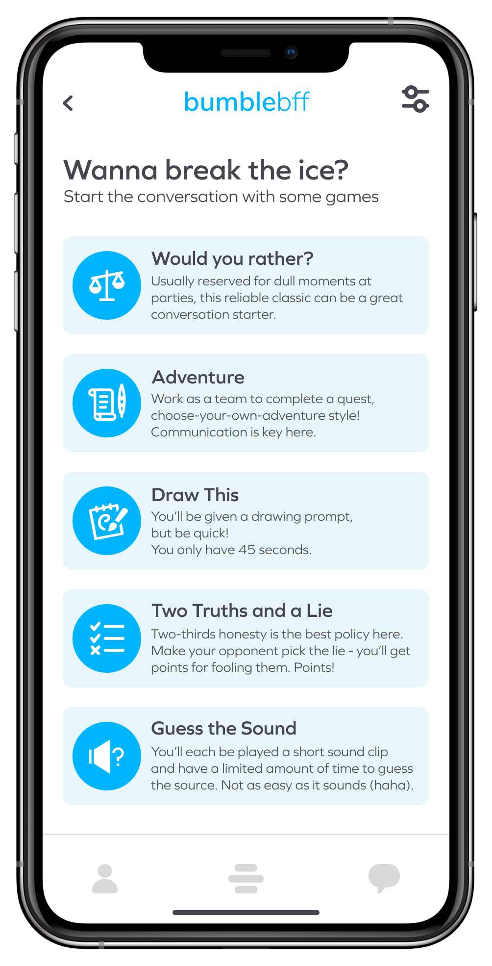
- Ice-breakers (games): We wanted to play off of what Bumble had already implemented in their dating mode, namely the question game, but take it further. We would add more games and allow users the option to invite potential friends to play with them. We felt this would greatly help facilitate conversations between users.
Once we agreed upon the direction to take our redesign, we divided work between us and were each tasked with building select screens for the prototype that we would conduct usability tests with. Madeline and Onaiza built the profile and group screens, respectively.
I was tasked with building the onboarding, homepage, daily matches, games, conversations, and chat screens along with the buttons and UI elements used for in-app navigation.
I prototyped each screen as they were completed and we were able to begin putting our ideas to the test with 4 participants.
Usability Testing and Iteration
The usability tests on our first prototype brought to light some changes we needed to make.
Move the slider on the pictures below to see what some of the frames looked like during our usability testing (slide right) and how we changed them once they were over (slide left).
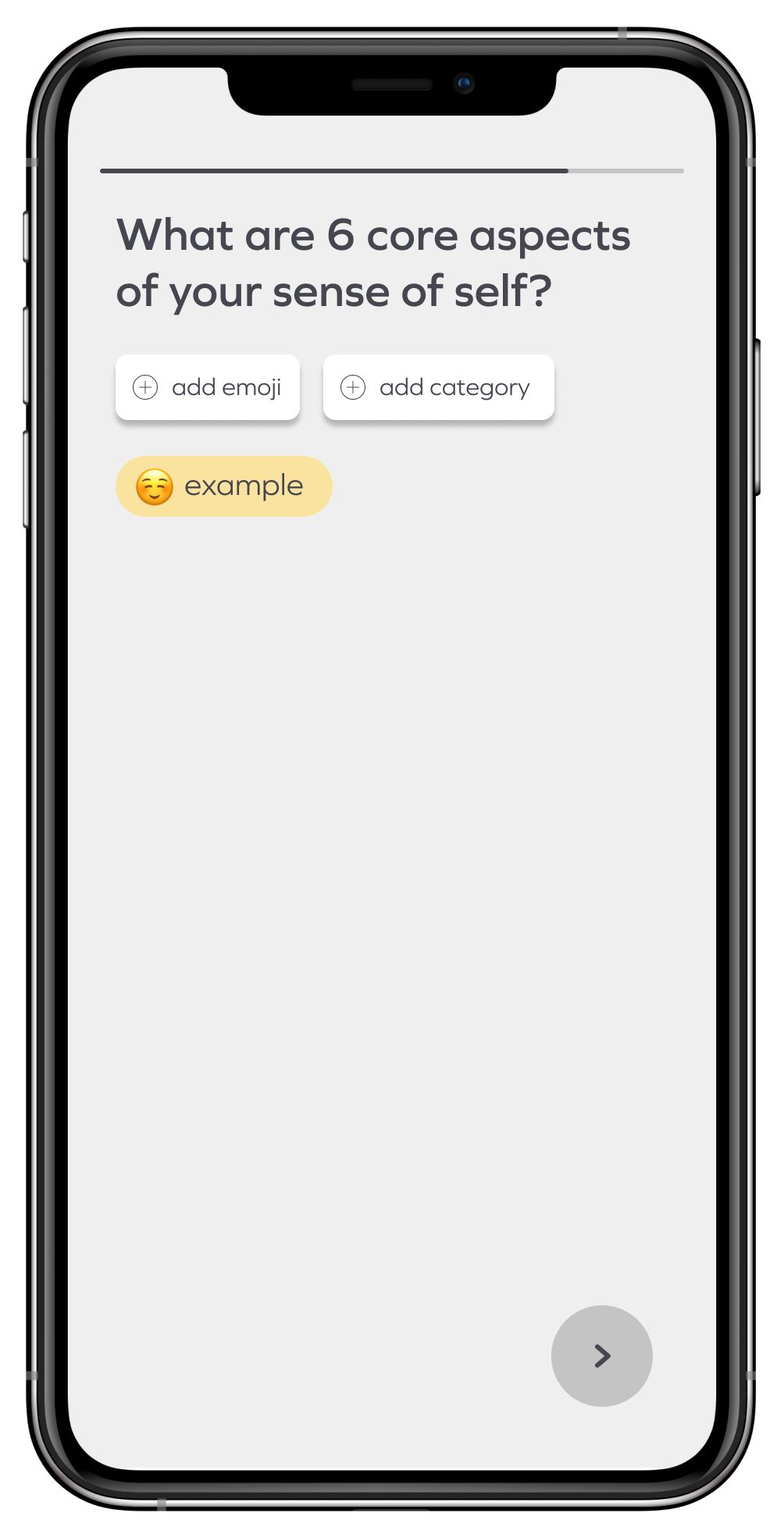
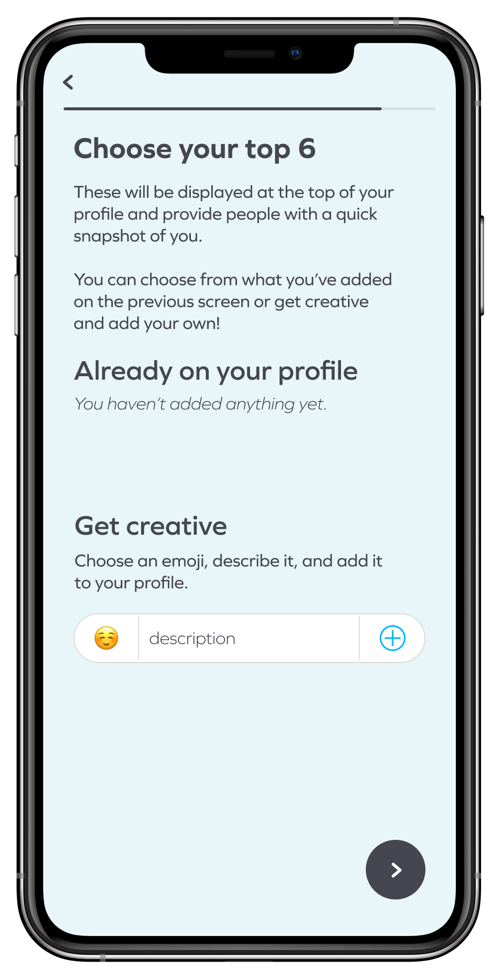
Top Six
This screen was included in the onboarding of our low fidelity prototype.
The goal was to allow users to create and add 6 things that were most important to them. These would display on their profile and serve as their snapshot, allow other users to get a quick idea of who they are and what they like.
All participants struggled with the wording on this screen as it was unclear what was expected of them, so I updated the instructions and created a new UI element to make things more understandable.
Icons
Participants brought to our attention that some of the icons were unclear, and those that we’d labeled had text that was too small to remedy this issue. Labels on buttons are already outside of Bumble's current design systems so we were hesitant to make them any larger.
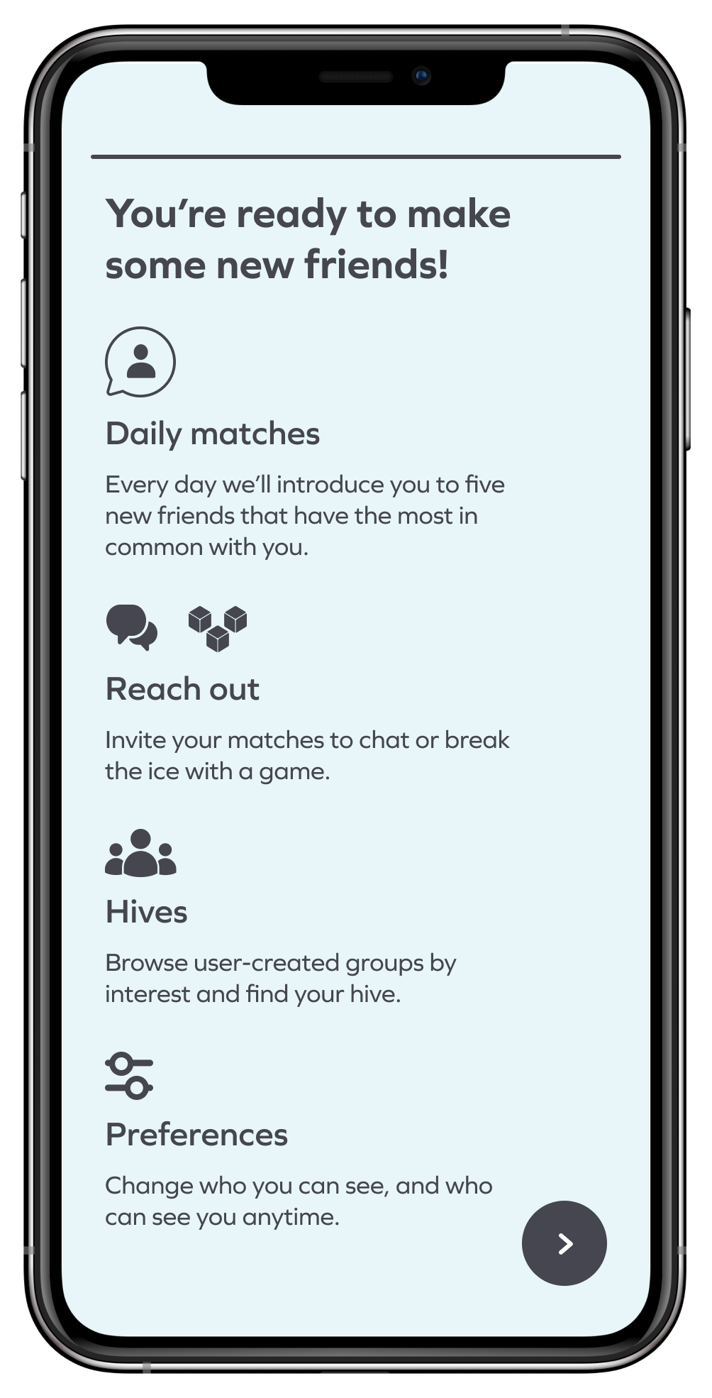
In response, we updated some of the icons and added this screen to be included at the end of onboarding.
It explains each new feature, what it does, and the icon that represents it.
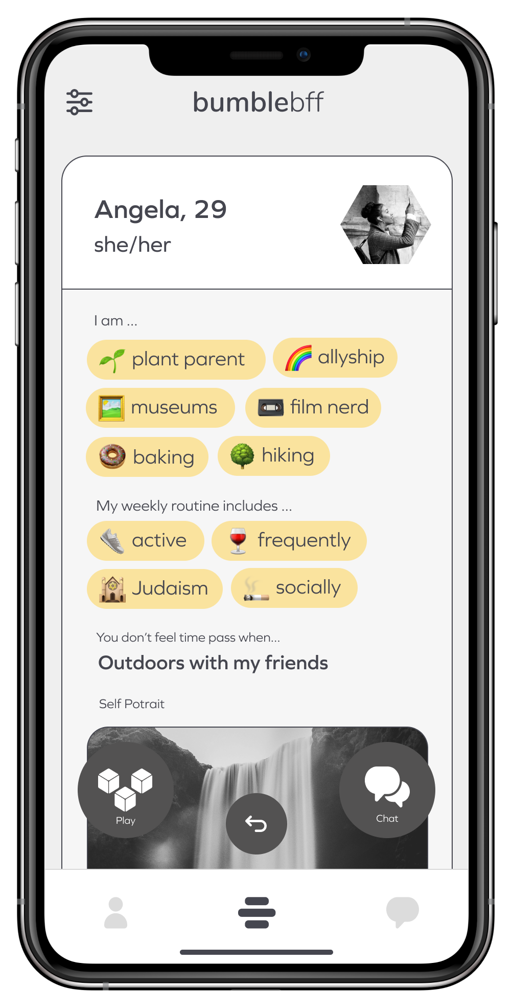
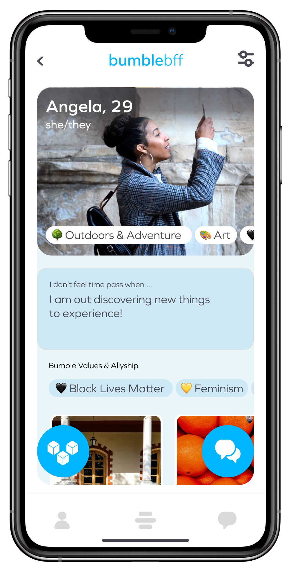
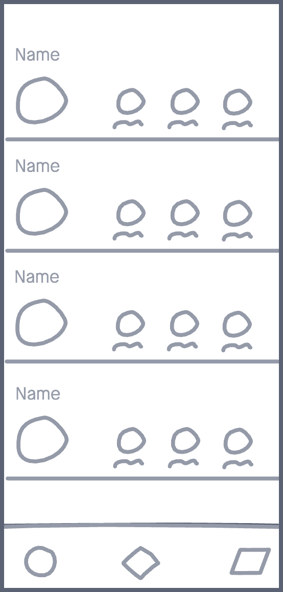
Profiles
While our research showed us that appearance doesn’t play as big of a part in platonic relationships, our participants disliked how small we made the profile pictures.
(We might have taken it a little far).
Participants also stated that the profiles seemed overcrowded.
We increased the size of the profile picture and made user’s top 6 scroll horizontally over it.
This change cuts down on cognitive load and allows users to get a better peek at their new friends.
Games
The game screen I designed was well-liked by our participants, but some stated the layout and style of it didn’t seem to fit with the rest of the app.
I updated the look of each button and added a description of the game (previously located behind a popup) to be more inline with Bumble’s current content library and cut down on the amount of popups.
I also got rid of “Yes or No” (nobody liked Yes or No 😔)
Overall, the features we'd added were well received by our particpants. We reviewed the results of our usability tests and discussed any changes that we needed to make.
Once we were all on the same page, I updated our wireframes and began transitioning them to high fidelity. There was one final change we discussed, and I'm sure you've noticed it by now, but I'd like to dive a little deeper into it before showing the final prototype.
Going Blue
We liked where things were going, but felt there could be more.
Taking inspiration from Bumble’s own IOS App Store page (which shows Bumble BFF dressed in blue), we decided that we should further change our design to let users know that they’re definitely not on the same Bumble they’ve known.
So, we took their blue and spiced it up a little.

The color palette I used when making our hi-fidelity prototype. Colors picked by Madeline Tachibana.
The Prototype
Below you'll see videos of users completing onboarding, checking daily matches, and finding groups to chat with using the prototype I created.
Onboarding
A user completing onboarding and finishing profile setup.
You'll see the shift to blue that takes place when the user selects "BFF" mode. Currently on Bumble, this screen is shown at the end of onboarding. We moved it closer to the beginning because the changes we made to the profiles meant each mode would now require its own onboarding experience.
You'll also see them creating 6 custom badges to add to their profile.
Daily Matches
Here you'll see a user checking out their daily matches.
Once they've found the profile of someone that interests them, they then debate on inviting them to play a game, or inviting them to chat. They decide to go the tried and true method of chatting and send a message off.
From there, they check their chats and see that they've already recieved a reply. It would seem that Angela was already on BFF, most likely playing our super cool games.
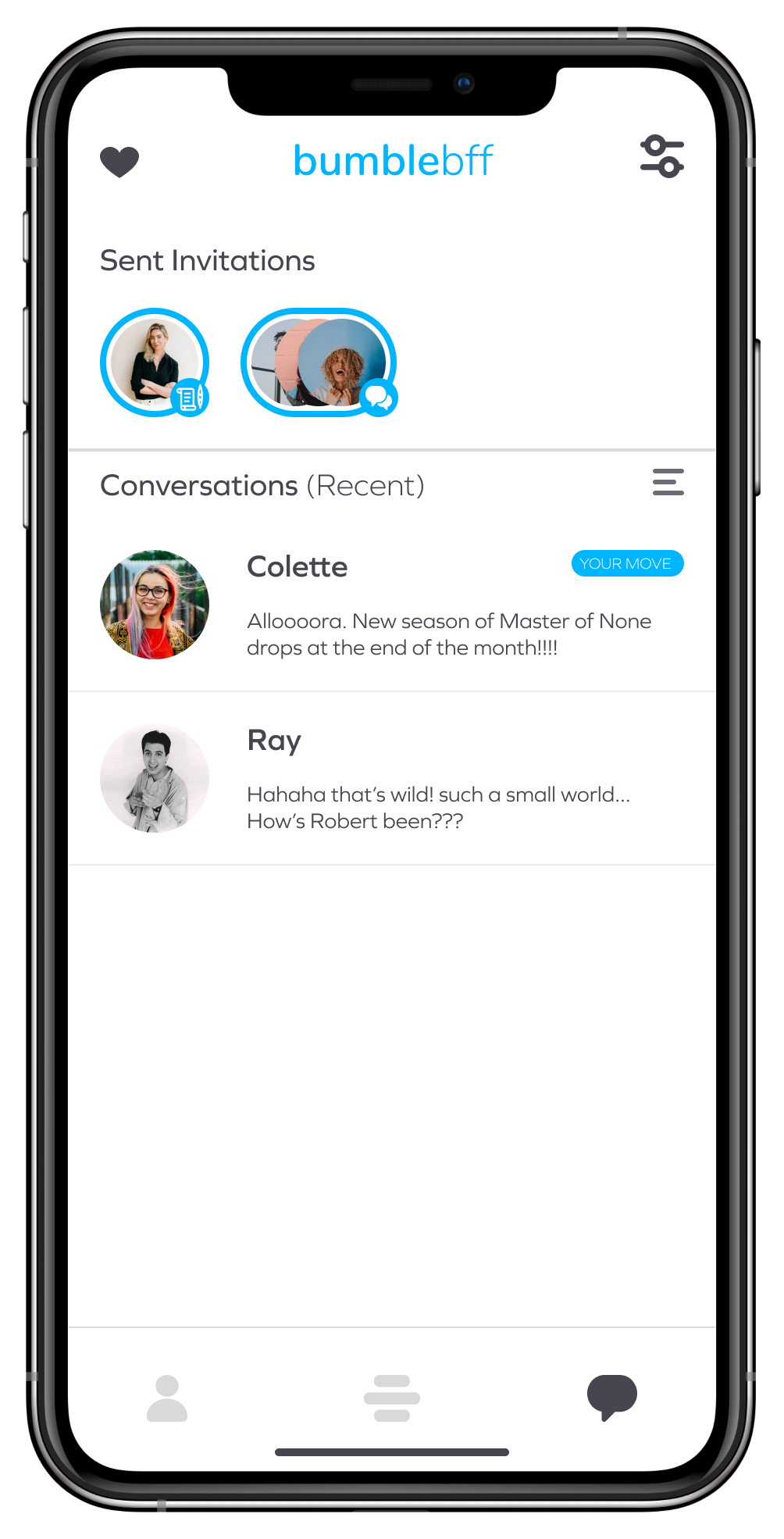
Chat & Groups
Shown here is a user navigating from their chats back to their homepage. From there, they check out the groups section, find one they like, and request to chat with them.
They then navigate back to their chats where they can refer back to any of their sent invitations to get an update on the amount of time remaining for the group to approve their request to join.
Next Steps/Final Thoughts
This was my first design sprint as part of a team and it was a great learning experience. Keeping project scope and feature creep to a minimum can be difficult when working on your own, but it's exacerbated when there are other people throwing around ideas. My team and I did a great job learning how to navigate this new space. There was a constant back-and-forth during our meetings and we had to really flex our critiquing muscles to find a balance between giving and recieving criticism while not get too attached to any particular ideas. These discussions were my favorite part of this whole project. My team and I went from literal virtual strangers, to respected friends. I'm thankful to have been given the experience of working and learning with them.
Due to time constraints, a portion of what we built wasn't as fleshed out as we would have liked, such as the group search which was really only born because a couple of our testers off-handedly mentioned they preferred to be surrounded by friends. I do think this was a good inclusion, but I don't feel our research fully warranted it. I also would like to revisit profile creation and initial set-up. From the start, we had the goal of making onboarding a faster process, but in our efforts to further customization, I believe it ended up having the opposite effect. If we had been given more time, we would have spent more of it on research and testing and pulled from a wider pool of people. This project was a lesson in scope-creep and time management and I learned that focusing on your research findings and fine-tuning your MVP's is far more important that change for the sake of change, but overall I'm very happy with how everything turned out and appreciate the experience.
Thank you (and you and you)
First of all, a giant thank you to my two team mates, Onaiza Kazi and Madeline Tachibana. None of this would have been possible to complete within two weeks if I was on my own, and they both did amazing work.
I’m lucky to have been on a team with those two.
Secondly, a huge thank you to the amazing artists on Noun Project whose icons were used in the creation of this protoype.
Finally, thank you so much for reading this!
I tried to keep this short and sweet, so if there's any questions you might have, want to see some more of the research data we collected, would like to check out the full prototype, or just want to chat, you can find me on LinkedIn at in/nickcalhoun or shoot me an email at nick@calhoun.design.
Let's work together!